Tuesday, September 27, 2011
Project 4
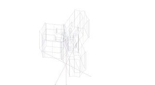
When working with my pattern originally, I was particularly interested in the shapes that the pattern created when different scales of it were overlapped. I explored this mostly in my colored rendering of the pattern. So when taking this into a 3d model, I wanted to experiment with similar properties. I started by extruding my pattern, and then scaled a copy of it. I next took the smaller pattern, and subtracted it from the larger mass, resulting in the images shown below.
Tuesday, September 20, 2011
Project 3
Step 1:
I began with the letter "O" from the Corona Font. Upon analysis I discovered that the character uses all of the same curves in each portion of the letter. I began to explore with the character and discovered that when rotated around a point, 3 characters connect, creating a triangular shape. This shape interested me so i continued to explore it.
Step2:
I next discovered that when reflected, the three character shape connects together, allowing for the pattern to be continued. Resulting in a full page of pattern. What interested me most about this pattern, is that due to the fact that the lines are all so closely related, you lose the sense of the letter "O". The composition becomes more about the shapes created by the character, rather then the character itself.
Line Composition:
For my line composition, I was most interested in the way that the pattern causes you to lose sight of the character used. By scaling a portion of the pattern, I wanted to highlight this aspect by allowing the viewer a reference for the pattern. By somewhat isolating one of the "o's" the character becomes more apparent, and the source of the pattern a little more clear.
Color Composition:
Finally, for my color composition, i wanted to focus mostly on the shapes that the characters make. By scaling a specific section of the pattern 3 separate times, there is a clear focal point to the composition, which is focused on the triangular shape that I first discovered.
I began with the letter "O" from the Corona Font. Upon analysis I discovered that the character uses all of the same curves in each portion of the letter. I began to explore with the character and discovered that when rotated around a point, 3 characters connect, creating a triangular shape. This shape interested me so i continued to explore it.
Step2:
Line Composition:
For my line composition, I was most interested in the way that the pattern causes you to lose sight of the character used. By scaling a portion of the pattern, I wanted to highlight this aspect by allowing the viewer a reference for the pattern. By somewhat isolating one of the "o's" the character becomes more apparent, and the source of the pattern a little more clear.
Color Composition:
Finally, for my color composition, i wanted to focus mostly on the shapes that the characters make. By scaling a specific section of the pattern 3 separate times, there is a clear focal point to the composition, which is focused on the triangular shape that I first discovered.
Tuesday, September 13, 2011
Structured Gothic
With this piece, the font that i used was the Corona Gothic. Though it is still ornate compared to other styles of fonts, in terms of Gothic, I found this font relatively simple and structured. It was this aspect that i wanted to convey in the image above. The characters all have true vertical lines, and they all maintain the same general size. So by keeping the overall layout of the board simple, as well as including datum lines, as well as super imposing characters, I attempted to emphasize the fonts unique characteristics.
Ornate Gothic
When exploring this font, the most distinctive characteristic that I found, and what I tried to convey, is that these characters are part of a whole word. Each letter is connected to one another to provide a smooth and artistic language, so when i highlighted the individual letters, I made sure to include the rest of the word. Finally, this font is ultimately seen as a piece of art, as it is a font intended for a tatoo. It is not intended to be legible. I therefore wanted to express this font as art, resulting in the image above.
Tuesday, September 6, 2011
Subscribe to:
Posts (Atom)


