
Tuesday, November 29, 2011
Linear Gallery Logo
Tuesday, November 22, 2011
Project 9
For this project my main intention was to take my original model and transform it into more of an abstraction. My original model was more or less a literal translation of my painting into a terrain like model. With this in mind, I focused on how my painting could be turned into a physical model.

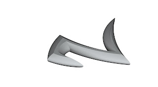


Original Model
As I began to model, I wanted to try to explore the characteristics of my painting as a whole. I concluded that the more graffiti like characters where what made the painting, in conjunction with the layers of transparency. So for my first step of my model, i began by simply making a three dimensional version of that graffiti character.
Step 1
I took this method and duplicated it several times.

Step 2
Interested with the idea of making these shapes into a model, I began to explore how I could make an object out of these shapes. Therefore, I began to rotate the shapes i created and explored how they could intersect with one another.

Step 3
I continued this process, resulting in my final object. I was primarily interested how this model was both able to capture the graffiti expression of the painting, as well as demonstrate a method of overlap and intersection that was vital in the painting that inspired me.

Final Model
Thursday, November 10, 2011
Project 8: Renderings

Natural Light

Artificial Light

Hybrid Lighting

Natural Lighting

Artificial Lighting

Hybrid Lighting
Project 8

For this project, I wanted to explore taking a painting of mine and abstracting it, ultimately resulting in a space. For my process, I began with a picture of my painting. I then took this painting and desaturated it as well as filtering it into fewer levels.

Once i had this image, i next took it into form z and created a terrain out of it. In my analysis i explained this painting as one with layers, of which make it seem somwhat organic and earthy. finally i extruded the higherarchical graphic shapes from the terrain, creating a "city like" space. In my renderings i wanted to capture the city like quality of my model, and accent the contours of the terain model made.

Thursday, November 3, 2011


For this Portfolio exercise, I was primarily interested in working in black and white and A-symmetry of the spread. With these designs I focused on putting my large concept shot of the project on either side of the spread, and allowing the more diagramatic drawings face into the black border. I wanted to be able to highlight my rendering skills with these spreads, which was my resoning for making those drawings clearly larger and more hierarchical.
Thursday, October 27, 2011

My intent of this project was simply to construct this bay to the highest level of detail and precision I could. For this particular rendering, i chose to illustrate the scene as a night render. I wanted to highlight the reflective quality of the glass, and by making a night scene, you are able to see the back wall in the reflection of the glass, which in my opinion helps give a better sense of the space. By rendering with wire frame on the outskirts, i wanted to suggest to the viewer that the context of the window bay, is continuous, after all this is part of the linear gallery. I didnt want to detract from the original bay i made, so by abstracting the space into wire frame, the general character of the context is expressed, without the need of immense detail.

Tuesday, October 11, 2011
Project 6

For this layout, I wanted to focus primarily on a view I discovered inside of my model. In this particular portion of the project, i wanted to explore more of the analytical aspect of my model, and explore more rendering techniques with line weight and renderings. The result is the image above, and my intensions were to show both an experiential view inside the model, as well as a view that allows the viewer to get a sense of what the whole model actually is.
Tuesday, October 4, 2011
Project 5

For my composition, i focused primarily on extruding my pattern from one another and highlighting it. When i first created this pattern, I was most interested in the way that the pattern overlapped with itself, and the triangular shape that the characters created. By making the central shape extruded through my whole 3d model, and by making it reflective, i wanted to emphasize the fact that it was created by the characters reflected in the surface. Finally, by highlighting blue portion of the model in wire frame, i wanted to emphasize my method of extruding the pattern at different scales through itself. I ended the composition by placing the image over the original pattern as a backround to show what the model was derived from.
Tuesday, September 27, 2011
Project 4
When working with my pattern originally, I was particularly interested in the shapes that the pattern created when different scales of it were overlapped. I explored this mostly in my colored rendering of the pattern. So when taking this into a 3d model, I wanted to experiment with similar properties. I started by extruding my pattern, and then scaled a copy of it. I next took the smaller pattern, and subtracted it from the larger mass, resulting in the images shown below.


Tuesday, September 20, 2011
Project 3
Step 1:
 I began with the letter "O" from the Corona Font. Upon analysis I discovered that the character uses all of the same curves in each portion of the letter. I began to explore with the character and discovered that when rotated around a point, 3 characters connect, creating a triangular shape. This shape interested me so i continued to explore it.
Step2:

I next discovered that when reflected, the three character shape connects together, allowing for the pattern to be continued. Resulting in a full page of pattern. What interested me most about this pattern, is that due to the fact that the lines are all so closely related, you lose the sense of the letter "O". The composition becomes more about the shapes created by the character, rather then the character itself.
Line Composition:

For my line composition, I was most interested in the way that the pattern causes you to lose sight of the character used. By scaling a portion of the pattern, I wanted to highlight this aspect by allowing the viewer a reference for the pattern. By somewhat isolating one of the "o's" the character becomes more apparent, and the source of the pattern a little more clear.
Color Composition:

Finally, for my color composition, i wanted to focus mostly on the shapes that the characters make. By scaling a specific section of the pattern 3 separate times, there is a clear focal point to the composition, which is focused on the triangular shape that I first discovered.

Step2:

Line Composition:

For my line composition, I was most interested in the way that the pattern causes you to lose sight of the character used. By scaling a portion of the pattern, I wanted to highlight this aspect by allowing the viewer a reference for the pattern. By somewhat isolating one of the "o's" the character becomes more apparent, and the source of the pattern a little more clear.
Color Composition:

Finally, for my color composition, i wanted to focus mostly on the shapes that the characters make. By scaling a specific section of the pattern 3 separate times, there is a clear focal point to the composition, which is focused on the triangular shape that I first discovered.
Tuesday, September 13, 2011
Structured Gothic

With this piece, the font that i used was the Corona Gothic. Though it is still ornate compared to other styles of fonts, in terms of Gothic, I found this font relatively simple and structured. It was this aspect that i wanted to convey in the image above. The characters all have true vertical lines, and they all maintain the same general size. So by keeping the overall layout of the board simple, as well as including datum lines, as well as super imposing characters, I attempted to emphasize the fonts unique characteristics.
Ornate Gothic

When exploring this font, the most distinctive characteristic that I found, and what I tried to convey, is that these characters are part of a whole word. Each letter is connected to one another to provide a smooth and artistic language, so when i highlighted the individual letters, I made sure to include the rest of the word. Finally, this font is ultimately seen as a piece of art, as it is a font intended for a tatoo. It is not intended to be legible. I therefore wanted to express this font as art, resulting in the image above.
Tuesday, September 6, 2011


Subscribe to:
Posts (Atom)